
Photography Blog
Welcome to my Blog page.
Here you’ll find some examples of recent personal work, as well as articles on photography related topics. I also post the occasional tutorial videos with tips and tricks to help explain technical aspects of photography.
If you’re subscribed to my newsletter, you’ll receive much of what I post here as well as additional content.
Scroll through the clickable menu on the right hand side to find specific articles or posts.
Loading posts…
Colour Space
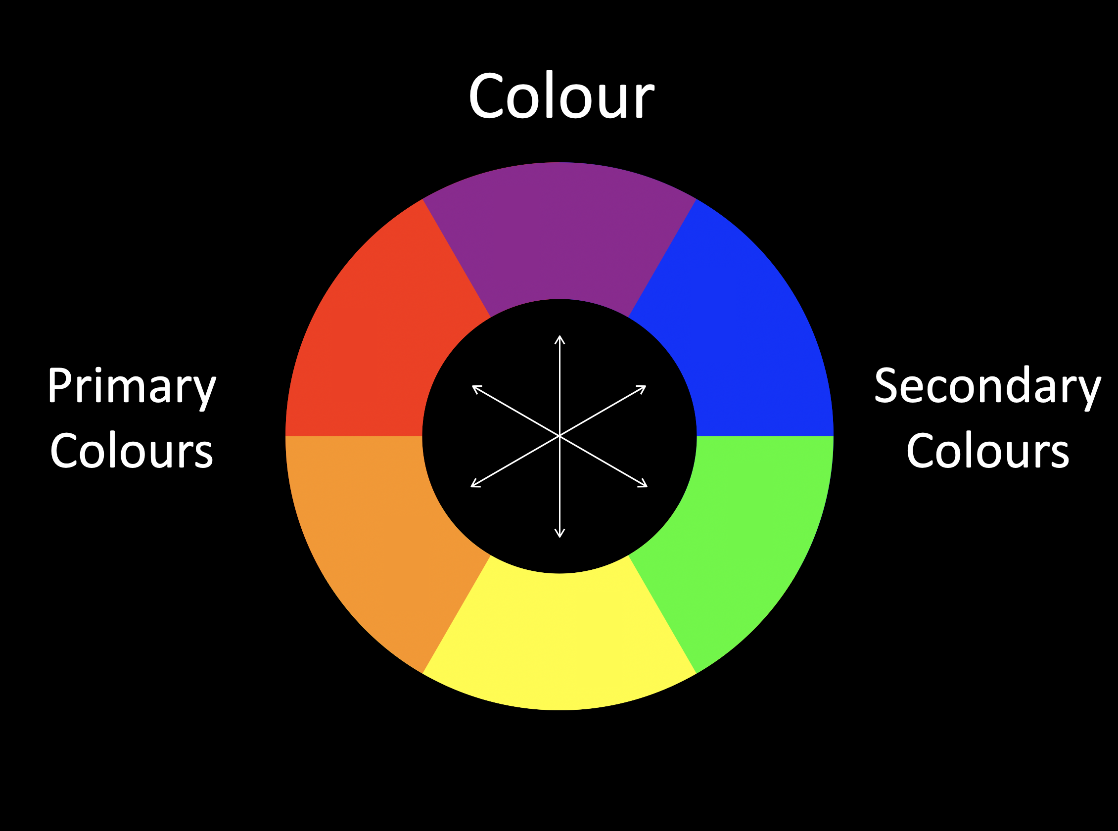
Colour wheel showing primary and secondary colours
What is it and should you even care?
Colour Wheel of Primary and Secondary Colours
The concept of colour seems pretty straightforward, something that’s very easy to understand. But when you start to delve a bit deeper it can become a bit confusing, especially in relation to Photography.
When thinking about colour, the starting point for most people is the artist's colour wheel which defines Red, Blue, and Yellow as primary colours. Where two colours meet on the colour wheel, they mix to produce what are known as secondary colours - Orange, Purple and Green. When primary and secondary colours sit alongside each other from the opposite side of the colour wheel, they are known as complimentary colours, which appear to make each other more intense.
Light on the other hand is described in a different way. The Primary colours of light are Red, Green and Blue (RGB), which combine to create the secondary colours Cyan, Magenta and Yellow (CMY).
Colour Wheel of Primary and Secondary Colours (Light)
Digital cameras record colour entirely in the colour space of light, RGB. This RGB data only becomes relevant to traditional theories of colour at the print stage of the photographic process, which - to add to the confusion - is based on using CMY and K (black).
Deciding how to accurately convey colour in what’s known as a colour space throughout the journey from camera to print is therefore an important decision for photographers.
Or is it?
As with all photography related questions, the answer starts with "it depends…" In the case of colour, it depends firstly on the format the file is recorded as, and secondly on the intended output or medium in which the final image will be viewed.
All digital cameras have an in-camera option of two colour spaces; Adobe RGB and sRGB. So what’s the difference and which one should you use? To answer this question, the first thing to understand is that in a digital sense, colour is represented as a virtual, three-dimensional shape, known as a colour space. This shape defines the range of available colours, known as a gamut. Adobe RGB is a larger colour space than sRGB, which means it renders a wider gamut, useful for recording a wide variety of subtle shades of the same colour. Imagine a subject wearing a red jacket, drinking a can of Coke standing next to a post box with a double decker bus in the background. That’s a lot of different shades of red, so It would make sense to record all of those variations by selecting the larger Adobe RGB colour space.
However, it still depends on a couple of things… first of all, if you're shooting RAW files, the colour space setting in camera becomes irrelevant. RAW files capture the full sensor data without an assigned colour space. The choice of colour space is made at the output stage of image processing in editing software. Colour space settings in camera only apply to JPEGs that are generated in-camera, so if you’re shooting JPEG files and want to record a wide range of hues, Adobe RGB would be the best option.
Another factor that affects colour representation is known as BIT Depth, which I won’t go into here, but it’s worth mentioning that while most cameras record what is known as 8 BIT or True Colour which displays 16.7 Million colour tones, the human eye can only differentiate from 2M - <10M colour tones.
Compare the two images below, recorded on a Canon camera set to record both JPEG and RAW files simultaneously. Notice how the reds on the left JPEG image appear more as of a block of solid colour, with less variation in hue compared to the RAW file on the right.
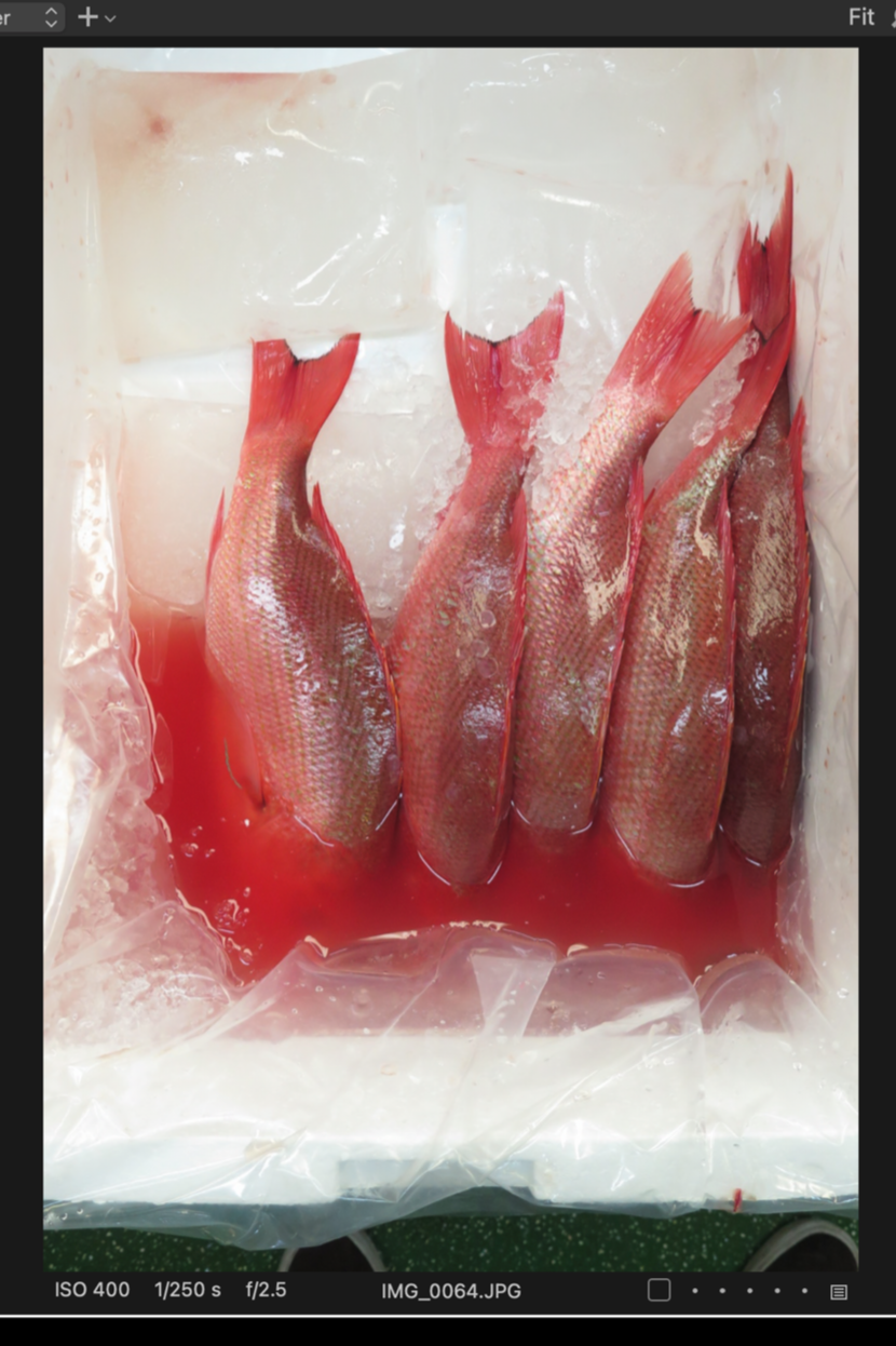
JPEG image recorded in sRGB Colour Space
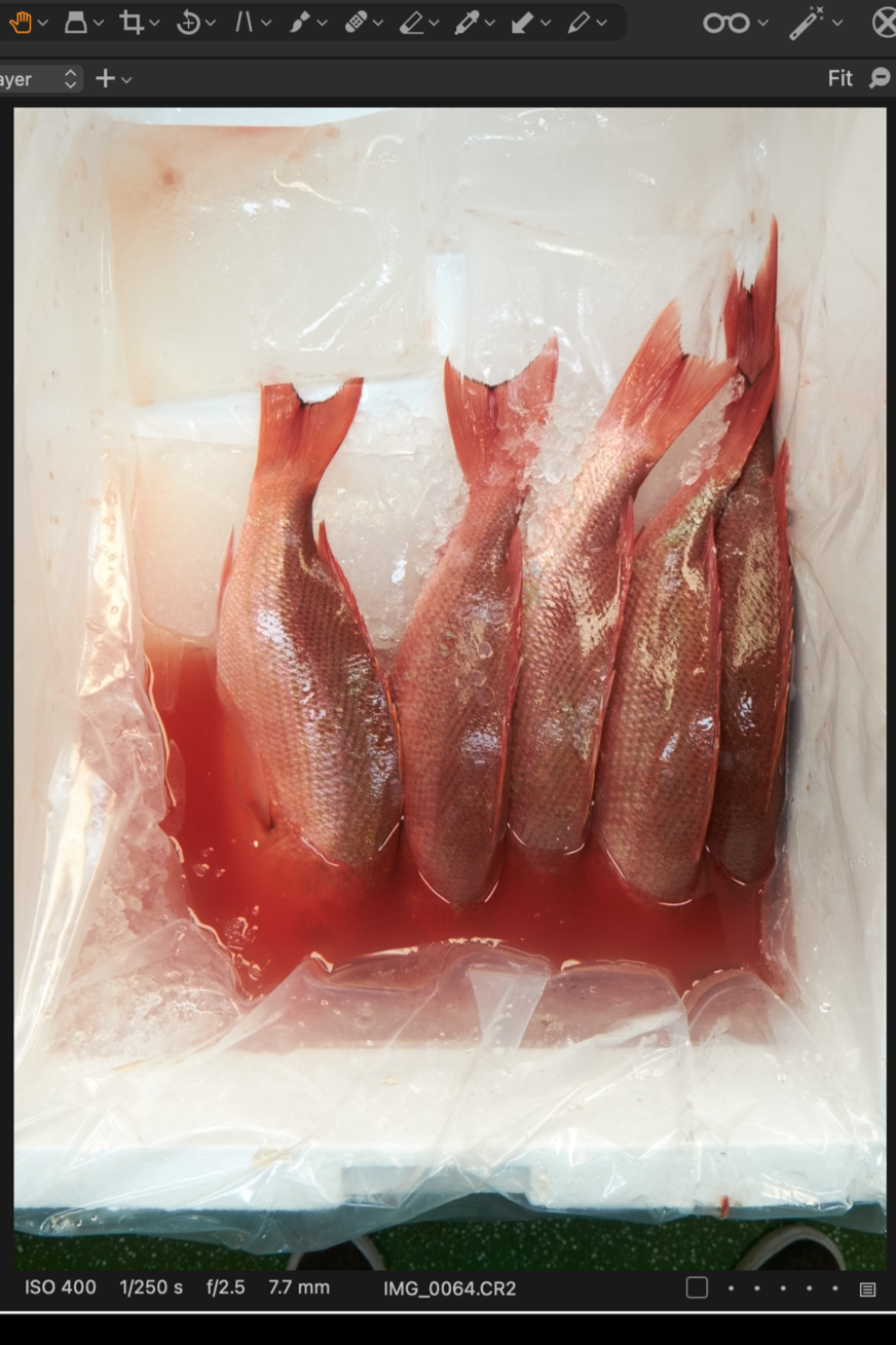
RAW image recorded with no Colour Space
The JPEG file recorded in the sRGB colour space reduces the shades of red to a more uniform hue, leaving the image flat and dull.
The next consideration is where the image will end up. Screens on digital devices are not all calibrated to render colour in the same way, so sRGB has become the universal default for all digital content. When an Adobe RGB file is displayed on an uncalibrated screen, the colours that fall outside the sRGB range get compressed, producing the result seen in the left hand image above.
It's important to note that while colours from an Adobe RGB colour space can be mapped onto the smaller sRGB colour space, the reverse is not possible - you cannot expand an sRGB file into the Adobe RGB colour space - you can’t recover colour information that wasn’t there to begin with!
So if the intended output is digital, sRGB is the best choice, even if the original file from the camera was record in Adobe RGB as a JPEG. If you intend to have your images professionally printed and want to render all those subtle colour variations, then the larger Adobe RGB colour space is the better option.
The general rule of thumb is to shoot RAW (which has no assigned colour space) or JPEG (with AdobeRGB) and then choose your colour space at the point of export - sRGB for anything going online or to screen, and Adobe RGB (typically as a TIFF file) for print.
Architectural Photography
Like most things in photography, architectural photography isn’t as easy as it seems. When we look at photos we often think “I could do that” and it’s no different with architecture. I often find that people take pictures of buildings as a way of easing themselves in to street photography. It’s not uncommon to feel nervous about photographing strangers in the street so even though that’s actually what people often want to do, they retreat in to the apparently easier option of simply photographing the buildings they see. This is often a stage in the process of someone’s development in exploring their areas of interest as well as finding their confidence as a photographer.
However, I think it’s hugely beneficial if you can identify your interests early on and focus your energy on specific genres with a clear idea of your own aims. If your interest is street photography and shooting people, then that’s the skillset and style you should develop. If you’re genuinely interested in photographing buildings and architecture, then you need to think about approaching your subject matter in a very different way to how you would shoot on the street.
Architectural photography is all about scale, perspective and design in my opinion. But that’s not to say the detail should be overlooked as there’s plenty of interesting stuff if you look closely.
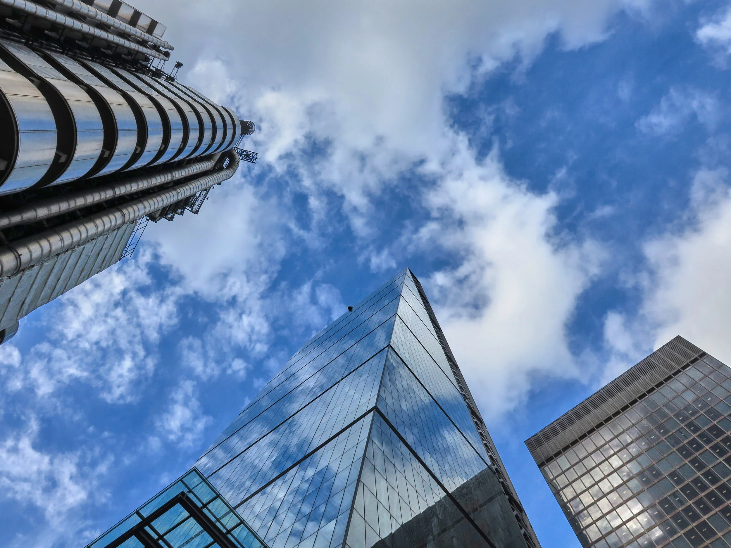
One of my favourite locations to take pictures of interesting buildings is in the City of London. With a rich architectural history that reflects the fascinating social history of this area, it is full of architectural gems, both old and new. Especially when it comes to tall buildings and skyscrapers, the obvious perspective is to look up as in the shot above of the Lloyds building and it’s neighbours the Leadenhall Building and the Aviva Tower. The same applies to many of the older buildings in the City. Indeed, this is a perspective that can easily be overlooked but can offer some unexpected and often rewarding surprises, often in the form of hidden statues or sculptures. Below are a few examples of some great, often overlooked architectural details in the City of London.

Gargoyle on the roof of a building, City of London

Ariel statue at Tivoli Corner, City of London

Dragon on top of a column in Leadenhall Market, City of London
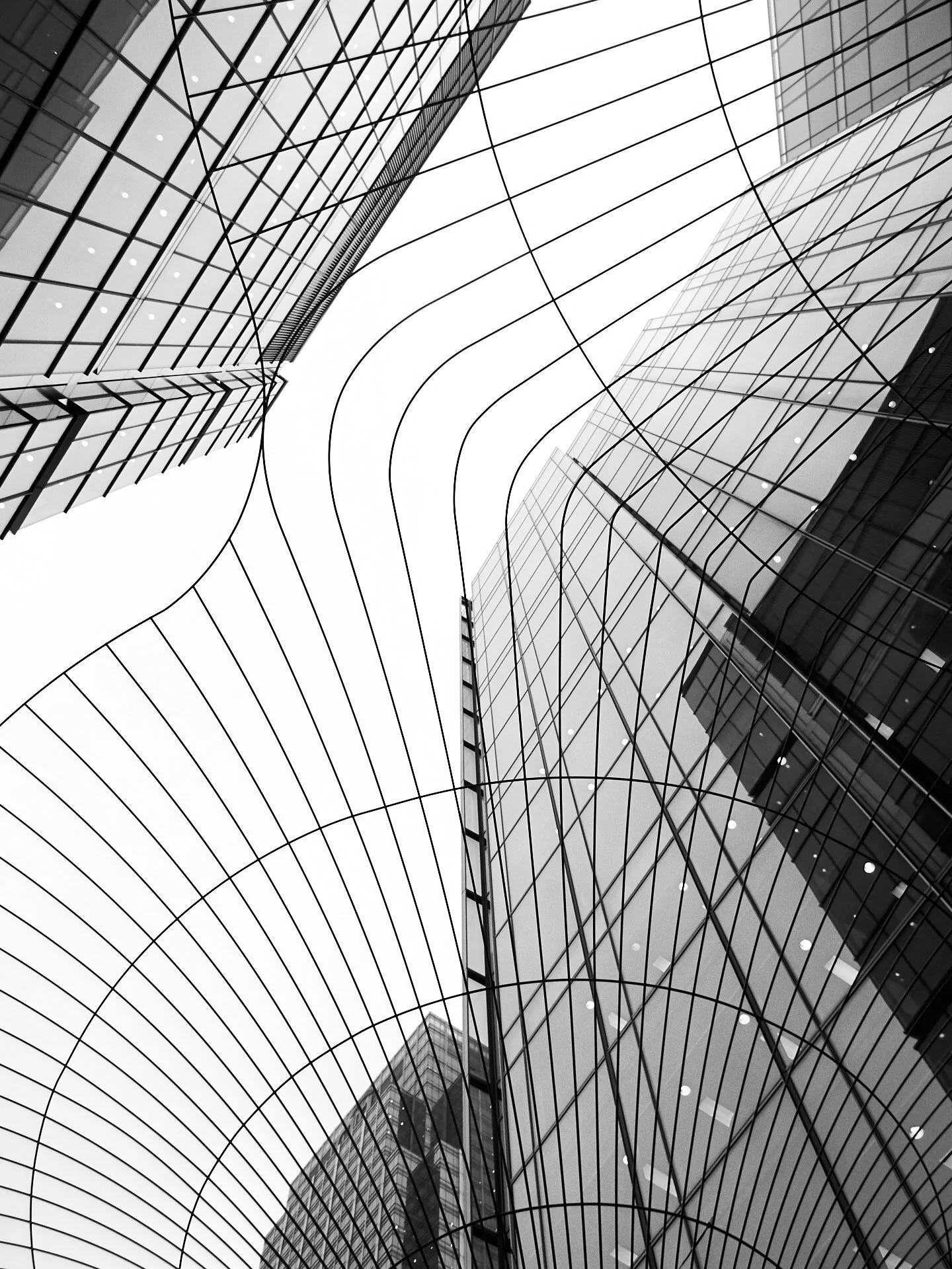
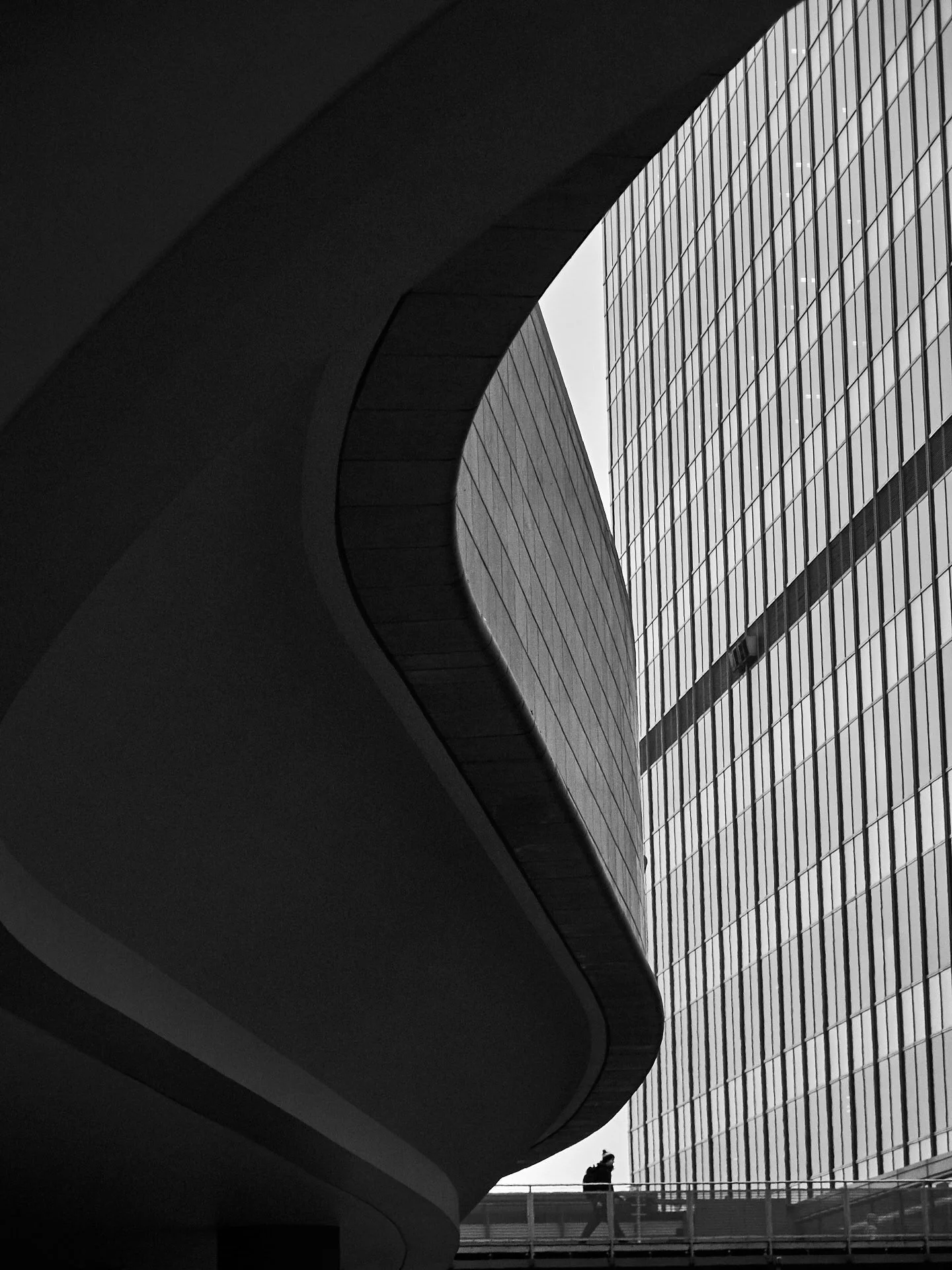
Photographing architecture can also present fantastic opportunities for both black and white and abstract images. The forms and lines within architectural design can be subject matter within themselves, as in the image to the left. But more often they are compositional elements leading the eye through a frame to a particular point of interest, as in the image to the right where the S shaped curve draws the viewer to the figure at the bottom of the frame.
Looking for the relationships between forms can be a useful way to add interest. In both of the these images, I’ve tried to juxtapose the smooth curves in the foreground with the more regimental, rigid formality of the buildings in the background.
In both these images, the conversion to Black and White has also helped in removing any distractions which colour can represent. The overcast sky also adds little value in these shots so is best used as a blank canvas against which the architecture is the main focus.

The inclusion of a figure adds scale and the shadows and branches help frame the building
One thing that I find interesting when it comes to discussions about defining certain genres in photography is how opinions can differ so hugely. I once met someone on a workshop I was running who told me about a landscape workshop they had previously been on. The photographer running that workshop had said that as soon as an image contained a person, he no longer considered it a Landscape Photograph. Of course, everyone has their own way of doing things but I personally don’t go in for such strict definitions. In fact, when it comes to Landscape, and possibly even more so Architecture, my personal preference is to include people. Architecture is after all designed by and for people and the built environment would be pretty sterile and lifeless if there were no people interacting with it. Including people gives a sense of scale and forms a connection with the built environment on a subconscious level.
Arguably, the inclusion of people starts to veer towards Street Photography in terms of style and genre. But like most things photographic, there is the potential for things to overlap and cross over between genres. That’s why I tend to avoid overly strict definitions and encourage people to define their own work in a way that makes sense to them.
I run workshops and also guided walks around the City of London which focus mainly on Street Photography but are also great opportunities for Architectural Photography

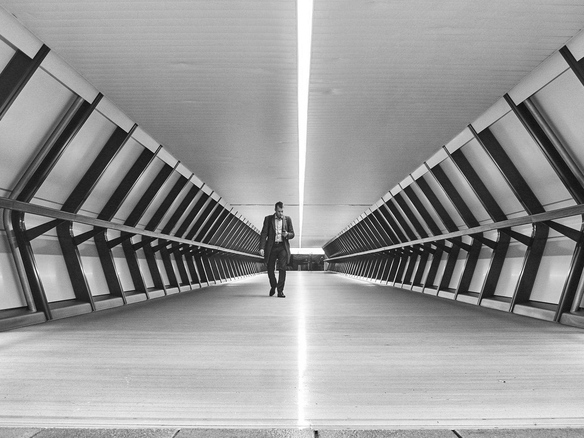
The slow shutter speed adds a sense of business as the people move through this walkway in the Docklands
The lone figure framed by the futuristic design adds a sense of scale
If you want to develop your architectural or street photography, I run small-group photography workshops in central London